LECTURE
By Adrienne Redd
adredd@journalist.com
http://www.netaxs.com/~adredd/
"Red irritates one group, another finds blue objectionable and a third set of people balks at yellow." -- Cecil B. DeMilleWhen the movie industry began, its artisans only had the capability to film in black and white. As it always does, technology pushed the envelope, and sound, color and even 3-D were added to the basic medium of film (and science fiction writers like Aldous Huxley and Neal Stephenson have even predicted tactile and interactive movies), but perhaps most powerful was the simple addition of color, which has become a metaphor for corporeal life, sensuality, sexuality and vitality. In an era when some audiences feel black and white films are hopelessly passe and Hitchcock's classic, Psycho, was (unimpressively) remade shot for shot, merely for the purpose of
 photographing it in color,
perhaps it's
worth our time to think about how color first came on the
cinematic scene,
not all at once, like Athena bursting from the head of Zeus, but
little by
little, trickling into our field of vision and how color has been
used,
either in predominantly black and white films or has shared the
screen,
often giving the sense of two worlds.
These ideas were first presented as a lecture comparing and
contrasting how
color has been used in black-and-white films or how color and
black-and-white have been used together for symbolic effect.
Basically,
since the 1980s, color has been used in film to delineate
different worlds
in its most sophisticated use, delineating subjective or internal
realities.
In the late 1930s, color began to be used in musicals and
action-adventures.
The first Hollywood full-color film was Becky Sharp
(1934), a film version
of the Thackeray novel, Vanity Fair.
photographing it in color,
perhaps it's
worth our time to think about how color first came on the
cinematic scene,
not all at once, like Athena bursting from the head of Zeus, but
little by
little, trickling into our field of vision and how color has been
used,
either in predominantly black and white films or has shared the
screen,
often giving the sense of two worlds.
These ideas were first presented as a lecture comparing and
contrasting how
color has been used in black-and-white films or how color and
black-and-white have been used together for symbolic effect.
Basically,
since the 1980s, color has been used in film to delineate
different worlds
in its most sophisticated use, delineating subjective or internal
realities.
In the late 1930s, color began to be used in musicals and
action-adventures.
The first Hollywood full-color film was Becky Sharp
(1934), a film version
of the Thackeray novel, Vanity Fair.
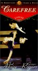 Originally, using color was much more expensive, so if a studio
couldn't
afford do the entire film in color, they used a little bit. One
example that
was not to be is RKO's Astaire-Rogers film, Carefree
(1938). RKO was a
little studio and didn't really use technicolor, which was an
expensive
process. One song-and-dance number of the film, featuring the
Irving Berlin
song, "I used to be color blind," was originally intended to be
in color,
but the studio changed its mind to keep costs down. The segment
still calls out
for color.
The partial filmography below of color and black-and-white films
includes
one example, Erich von Stroheim's Greed, from the 1920s,
two from the 1930s
and three from the 1940s. There are only a handful more color
and black and
white films from the early days of film (including some silent
films with
color, Kid Millions (1934), Solid Gold Cadillac
(1956) and Ben Hur (1959)
in
which Christ is in color.
Originally, using color was much more expensive, so if a studio
couldn't
afford do the entire film in color, they used a little bit. One
example that
was not to be is RKO's Astaire-Rogers film, Carefree
(1938). RKO was a
little studio and didn't really use technicolor, which was an
expensive
process. One song-and-dance number of the film, featuring the
Irving Berlin
song, "I used to be color blind," was originally intended to be
in color,
but the studio changed its mind to keep costs down. The segment
still calls out
for color.
The partial filmography below of color and black-and-white films
includes
one example, Erich von Stroheim's Greed, from the 1920s,
two from the 1930s
and three from the 1940s. There are only a handful more color
and black and
white films from the early days of film (including some silent
films with
color, Kid Millions (1934), Solid Gold Cadillac
(1956) and Ben Hur (1959)
in
which Christ is in color.
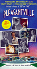
Rumble Fish (1983)
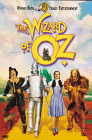 black-and-white and that someplace over the
rainbow,
that someplace far, far away where there isn't any trouble is the
technicolor world of Oz. Like David and his fraternal twin,
Jennifer, who
get injected into Pleasantville, Dorothy says from the
beginning that she
wants to go back home, but unlike Dorothy, Jennifer first insists
on going
home and ultimately decides to stay, because she discovers her
own
intellectual abilities and a world in which she doesn't have to
use her
sexuality to construct an identity, so in that sense Kansas is
more real for
Dorothy and Pleasantville is more real for Jennifer. This forces
us to
think about what is really ideal and also what is subversive.
What does it
really mean to corrupt paradise? And what form does that
corruption take?
The controversy over Ted Turner's sometimes overly vivid
colorization of old
films in the 1980s may have led to a new appreciation for them in
their
original state and led to some thought about how the two
variations on the
film medium differed. (There is a crispness and brightness to
some
black-and-films which is entrancing. Gowns from old
black-and-white
musicals, for example, were designed to be especially bold and
beautiful in
black and white, and the cultural commentator Camille Paglia has
waxed rhapsodic
on the sharp-edged whites and velvetly blacks of Bergman's
Personae.
Color and black-and-white can be used to differentiate fantasy or
an
alternate reality and black-and-white can be used to show a
different
historical period or for memory or flashbacks (as in the sepia
scenes in the
current film Beloved), changes in states of reality,
subjective reality and
idealized plane of existence.
We see this in Stairway to Heaven, in which earthly life
is in color and
heaven is escetic and cooly futuristic.
black-and-white and that someplace over the
rainbow,
that someplace far, far away where there isn't any trouble is the
technicolor world of Oz. Like David and his fraternal twin,
Jennifer, who
get injected into Pleasantville, Dorothy says from the
beginning that she
wants to go back home, but unlike Dorothy, Jennifer first insists
on going
home and ultimately decides to stay, because she discovers her
own
intellectual abilities and a world in which she doesn't have to
use her
sexuality to construct an identity, so in that sense Kansas is
more real for
Dorothy and Pleasantville is more real for Jennifer. This forces
us to
think about what is really ideal and also what is subversive.
What does it
really mean to corrupt paradise? And what form does that
corruption take?
The controversy over Ted Turner's sometimes overly vivid
colorization of old
films in the 1980s may have led to a new appreciation for them in
their
original state and led to some thought about how the two
variations on the
film medium differed. (There is a crispness and brightness to
some
black-and-films which is entrancing. Gowns from old
black-and-white
musicals, for example, were designed to be especially bold and
beautiful in
black and white, and the cultural commentator Camille Paglia has
waxed rhapsodic
on the sharp-edged whites and velvetly blacks of Bergman's
Personae.
Color and black-and-white can be used to differentiate fantasy or
an
alternate reality and black-and-white can be used to show a
different
historical period or for memory or flashbacks (as in the sepia
scenes in the
current film Beloved), changes in states of reality,
subjective reality and
idealized plane of existence.
We see this in Stairway to Heaven, in which earthly life
is in color and
heaven is escetic and cooly futuristic.
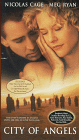
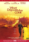
This dichotomy of heaven and earth or a real and idealized world (similar to the one in Pleasantville) also exists in Purple Rose of Cairo, Woody Allen's fantasy in which a waitress, Cecilia, escapes from Depression-era dreariness into the movies and one of the characters from the movies, Tom Baxter (played by Jeff Daniels) (he immediately is colored) escapes from the screen to be with her. Notably, the film opens with Irving Berlin's Cheek to Cheek, with the lines, "Heaven, I'm in heaven..." This emphasizes the idea of the humdrum world being in color and heavenly places being in black-and-white. In this film, as in Pleasantville, the ideal world is also boring and very limited. In Purple Rose of Cairo, the real world appears in wsshed out, almost sepia color and the escapist world of the movies is in shimmering black and white. Interestingly, as is always the case, the dreamworld has its limitations. For examples, when Tom Baxter has walked out of the film, the other characters plead with the audience, "Don't turn the projecter off! It gets black and we disappear." In many of these films, color represents the pain, sensuality, conflict, beauty, evanescence, mortality of human life. Black-and-white (and gray represent ethereality, repression and the spiritual world. In the 1946 version of the Noel Coward play Blithe Spirit, the first wife, Elvira appears all in gray and one of the black-and-white characters on the silver screen in Woody Allen's The Purple Rose of Cairo says "We're not human..." A more macrabre way of putting this is that when people die, they actually become gray (as their blood ceases being pumped through their bodies.) In another recent film about heaven, What Dreams May Come, intensely saturated color andCLIP 1: From Stairway to Heaven -- the protagonist (David Niven), a WWII pilot, is about to crash his plane (and has no parachute), and meets (over the radio) an operator (Kim Hunter) to whom he speaks for what he thinks are the last moments of his life. The angels/heaven make a mistake and the pilot finds himself floating in the ocean, but not dead. Next scene is heaven (in BandW) where he should be and the error is discovered.
 fantastic matte shots are used to create a
heightened
unreality. And this is the use of color in a 1991 film starring
Jeremy
Irons, titled Kafka -- two worlds -- clerk by day,
writer by night, surreal
journey to a castle.
I'll also note here that Woody Allen and Steven Spielberg were
two leaders
of the outcry at Turner's colorizatinof old films and that they
both went on
to intergrate the two types of film stock.
Color can also symbolize a sense of wonder, and it is to this
end that it
is used in The Wizard of Oz, which is currently playing in
the theaters, and
Wings of Desire. This film by Wim Wenders is one of my
all-time favorites.
(It was remade as City of Angels this year and it wasn't
bad.) The remake
also uses some color and black-and-white when the angel, who is
named Seth
and played by Nicholas Cage in the remake, chooses to fall.)
Basically, the
idea of the movies is that angels watch unseen and can comfort
people, but
they can also choose to become human, to trade immortality for
human senses
and experiences. Interestingly, there are inconsistencies in the
mythology and
symbolism of color. For example, the people in Pleasantville
know about
color and recognized it when they see it. Damiel and the other
angels in
Wings of Desire do not.
The juxtaposition of seeing in color and black-and-white also
give the sense
of overlapping co-existent dimensions -- angels can't see
color, but they can
hear music and hear thoughts (and in Stairway to Heaven,
the angle can stop
time.) So there is a trade-off between the corporeal and
ethereal worlds.
fantastic matte shots are used to create a
heightened
unreality. And this is the use of color in a 1991 film starring
Jeremy
Irons, titled Kafka -- two worlds -- clerk by day,
writer by night, surreal
journey to a castle.
I'll also note here that Woody Allen and Steven Spielberg were
two leaders
of the outcry at Turner's colorizatinof old films and that they
both went on
to intergrate the two types of film stock.
Color can also symbolize a sense of wonder, and it is to this
end that it
is used in The Wizard of Oz, which is currently playing in
the theaters, and
Wings of Desire. This film by Wim Wenders is one of my
all-time favorites.
(It was remade as City of Angels this year and it wasn't
bad.) The remake
also uses some color and black-and-white when the angel, who is
named Seth
and played by Nicholas Cage in the remake, chooses to fall.)
Basically, the
idea of the movies is that angels watch unseen and can comfort
people, but
they can also choose to become human, to trade immortality for
human senses
and experiences. Interestingly, there are inconsistencies in the
mythology and
symbolism of color. For example, the people in Pleasantville
know about
color and recognized it when they see it. Damiel and the other
angels in
Wings of Desire do not.
The juxtaposition of seeing in color and black-and-white also
give the sense
of overlapping co-existent dimensions -- angels can't see
color, but they can
hear music and hear thoughts (and in Stairway to Heaven,
the angle can stop
time.) So there is a trade-off between the corporeal and
ethereal worlds.
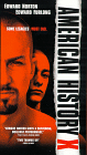
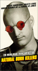
CLIP 2: From Wings of Desire, about a third of the way through the movie. The angel, Damiel says, "I'm going to take the plunge...." and in the sequence of his falling he and the other angel see in black and white and this also makes sense because they start out east of the Berlin Wall. Damiel falls and the other angle carries him to the west side of the was and he also begins to see. He stops a stranger and asks about the colors in the graffiti on the wall.Color can also convey subjective states of perception or time. This is the case in American History X (1998) in which the present is always in color, giving the viewer a greater sense of immediacy and some nagging illusory sense that one could change it (if it were the here and now and not merely the now) There is also one final scene of childhood done in color, all the more poignant because the rest of past has been in black and white. (There is an analogy here to be drawn to Jame Joyce's having wanted to color-code his novel Finnegan's Wake to signify subjective time. Unfortunately, this was too expensive to do.) As it can be uses to convey subjective time, color can also be used to delinieate internal realities. The most complex use of coding, using different stocks, occurs in Oliver Stone's Natural Born Killers (1994) followed by a film by Peter Greenaway released in 1998 called The Pillow Book. In these two films, color and black and white convey identity. There is also some intimation in both films of how the past shapes us -- that who we are is who we were. Another example of using a radical change in style as an expressive device occurs in Art Spiegleman's powerful cartoon memoir of World War II, Maus: A Survivor's Tale, Vol. II. At one point, we see for the first time a natural portrait of the author's father as a handsome young man after having only seen him rendered cartoonwise as a querulous old man.
CLIP 3: Natural Born Killers. In the opening sequence, we see animals -- an eagle, a coyote and a rattler -- that are thought of as "natural born killers." (This film also struggles to make the point that media attention is paid to killers and not some intrinsic aspect of their nature that emphasizes that they are killers.") Mickey and Mallory are in a roadside diner. When he first speaks to the waitress, Mabel, we see Mickey's subject view of the world in black and white. I think this supports the idea that he is sociopathic, but that Mallory, have been sexually abused sees in color, a metaphor for knowing the difference between right and wrong. It is not until she is shown sexual attention (by someone other than Mickey) that she ever becomes violent in the film. Other customers come into the diner (with a deer on their truck to show that they are killers too, in their own way) and melee ensue. Watch carefully when Mickey becomes violent and we see his view of the situation in black and white.Color is also used to convey point of view or identity in Rumble Fish, in which it arises from the subjective representation of the colorblindness of the protagonist's older brother. Interestingly, Rusty, the protagonist's name, is also a word for a color (a shade of red) and the implication is that his older brother can't see him. In the final scene, after his brother is dead, he sees himself in color in a reflection in the window of the police car and he goes into a rage. Another observation about this film is that like the films about angels and heaven, there are two worlds: the gritty world of New York streets and the fabled world of California to which the older brother had been and he says that California is like a beautiful heroine addict who can't see that she isCLIP 4: The Pillow Book. The father of the protagonist in this film always performed a birthday ritual for her, painting calligraphy on her face and body. She searches for other men who can do this throughout the film. Notably, when she looks in the mirror in this opening she sees herself in color, a reinforcement of the creation story her father tells as he paints her.
 dying, even when you
show her the
needle tracks.
dying, even when you
show her the
needle tracks.
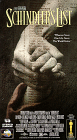
CLIP 5: The final scene of Rumble Fish, in which we see the colored, flopping fish and Rusty James sees his dead brother. Rusty James picks up the fish and dumps them in the river. He sees reflection in color in the window of the police car.Interestingly, Coppola has talked in interviews about being influenced by director, Nicholas Roeg, who made a film called Don't Look Now (1973), a gripping and macabre film about a couple in Venice mourning the accidental death of their young daughter. The film is not a black-and-white film that uses color sequences, but color, especially red, is used highly symbolically to foreshadow the moments of horror. Some films also use color highly symbolically, like The Last Emperor, in which the imperial China is shown in golden light; communist china is awash with red and post-communist China is khaki. Other interesting uses of color including films that contain flash backs in black in white, also the nearly sepia tones of McCabe and Mrs. Miller and the decision to use "no earth tones" in the television show, Miami Vice. A case can be built for a subset of this idea of identity -- the frustration and limited roles of women -- by looking at The Women, directed by John-Michael Albert and written by Claire Boothe Luce (being remade), Pleasantville and, I know this is a stretch, Cries and Whispers. In The Women, about a upper-class society lady whose husband leaves for sultry Joan Crawford, the only scene in color is a fashion show which we can either interpret as a sustained advertisement or a hint that these women's lives are totally superficially and all that is important is clothes and appearance. Ultimately, to me the far more interesting thing is that there is not a single male -- I suspect that not even the lapdog is male. In Pleasantville, the mother, played by Joan Allen, masturbates after Jennifer, her daughter from our contemporary world, explains sex to her. When she does, she then becomes colored (but not before a tree outside their house bursts into flame at her moment of organism). Cries and Whispers does not integrate color and black and white, but it is highly stylized. Skin tones, white, black and red are the only colors in the film, almost without exception and the film is in fact about women's highly limited roles, with illicit passion (signified by red) and death (signified by blood) being the only escapes. Color can be used to signify what is most real -- either subjectively to the characters or in some metaphysical sense. For example, only the paintings in The Picture of Dorian Gray and Portrait of Jenny are seen in color and this is an indication that they are, in some sense, the most real thing in the film. Whether in color films or color and black-and-white films, red is used most frequently to grab the viewer's attention. It symbolizes sex, sensuality, pleasure, sin and is the color of blood and red roses. It is the color of the sun the angels can't see when they gather at sunrise and sunset to hear the music of the spheres in Wim Wenders' Wings of Desire and this year's remake, City of Angels. It is blood that the angels see when they fall. It is the color Antonioni's first color film, Red Desert, and it is the red sand in the hourglass in and the poison red poppies in The Wizard of Oz. It is the color of the red rose after the first sex in Pleasantville and the red rose that the foppish angel sees in Stairway to Heaven and he comments rather self-referentially, "One is starved for technicolor up there." It's also the first colors that creep into the black-and-white world of Pleasantville -- in the form of pink bubble gum, red tail lights and pink tongues. (Characters know what color is, as opposed to Damiel in Wings of Desire, who sees it for the first time when he chooses to fall.) An aside -- red is usually the color used to designate obsession, with the notable exception being Greed (1925), the Erich von Stroheim film which featured hand-coloring of the gold coins with which McTeague becomes obsessed. To pick up my initial inquiry about the relationship between color in film and color in painting -- there were Impressionists who used a spot of red as a focal point in many of their paintings. Red is the only color in Schindler's List an as such it is used to engage attention. I propose that in the scene where Schindler watches the little girl in the red coat running through the streets that he is become more morally engaged with the people being killed fall below him and, in fact, that's what the movie is about, his moral engagement. As you recall, heartbreakingly, the next time we see that little girl in her red coat, her lifeless body is being loaded onto a wheelbarrow to be carted away.
 Like the black-and-white of Schindler's List, Spielberg's
most recent
evocation of WWII, Saving Private Ryan (1998) is drained
of color,
especially during D-Day scene (to evoke the sepia of old movies
and to
reinforce the starkness and the sensory overload.)
Like the black-and-white of Schindler's List, Spielberg's
most recent
evocation of WWII, Saving Private Ryan (1998) is drained
of color,
especially during D-Day scene (to evoke the sepia of old movies
and to
reinforce the starkness and the sensory overload.)
CLIP 6: Schindler's List. Schindler watches the murder and chaos in streets of Germany from his position on horseback high above on a plateau overlooking the city. His physical distance and height signify his initial stance of emotional detachment, but the use of red in the coat of the little girl running through the streets below also signifies his growing moral engagement with the lives of the Jews who are dying around him. Interestingly, the red of the coat is not shown in the last frames as when the little girl runs inside a house and hides under a bed. This scene is followed later in the film by the scene where we see her lifeless body being loaded onto a wheelbarrow to be carted away.This last example, using one character highlighted in color (who is never named and who never speaks) designates the subjective focus of another character, Oskar Schindler, who makes the transition from detached greed and selfishness to righteous concern. It is arguably the most emotionally powerful uses of color in a predominantly black and white film, but the more subtle uses of color and black-and-white together in the recent films of the 1990s are harbingers of still more sophisticated and interesting uses of color to convey inner worlds and subjective views.
Adrienne Redd has written
about
film, theater, music, the visual arts,
politics and the environment for 15 years. She lectures on film
and leads a
monthly film discussion for the County
Theater in Doylestown, Pennsylvania.
She is writing a
book about
American political activists, working on a
documentary and pursuing graduate work in sociology at Temple
University in
Philadelphia.
This lecture copyright (c) 1999 by Adrienne Redd.
Site Index: Double Click on Your Choice of These Up-to-Date Files
Media Theory and
Culture
|| Bookstore
|| The Slush Pile
|| Discourse
Analysis
|| Essays in Social
Science
Technical Writing
and Web Site Development
|| Natural Language
Processing
|| Site Map and
Index